Your site looks AI-generated. Here's how to fix it
The default look is underspecified taste, not a hard model limit. Brief with references, name visitor jobs, then audit the live URL and accessibility tree.
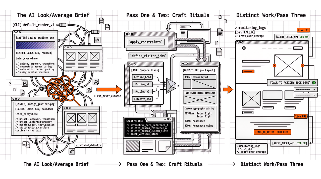
Stakeholders rarely say “your typography hierarchy is weak.” They say the site looks AI-generated. That complaint is usually accurate about defaults, not proof that models cannot ship distinctive work. When the brief is vague (“modern”, “clean”, “premium”), generators and humans both fall back on the same training-set average: indigo heroes, three feature cards, Inter everywhere, and copy that could sell any SaaS.
Banning AI assistance does not fix the average. Removing the average from the brief before the first generation does, then two honest passes on the live URL. We learned that the hard way while shipping Apogee Watcher’s public site: without written design rules, every agent draft drifted toward the same marketing-site defaults (soft shadows, rounded cards, stock gradients). The steps below are what we use on our marketing pages and on client landing pages. They clean generic defaults. They do not replace a designer for a full brand system.
Why the AI look shows up so often
Public UI training data is heavy on starter kits, component demos, and tutorial landings. Predictable next tokens therefore favour the same layout grammar and the same safe palette. Teams amplify that by pasting soft adjectives into the prompt and accepting the first render that “looks done.”
The fingerprint is easy to list once you have seen it twice: cool purple-to-blue gradients, evenly rounded cards with soft shadows, icon rows with abstract nouns, and body copy that starts with empower, unlock, or transform. None of those choices is illegal. Together they look like a template nobody chose on purpose.
On Watcher we treat that fingerprint as a reject list, not a mood board. Our public design system (Technical Brutalism) bans purple or indigo gradients, glass, pill-shaped buttons, blurred shadows, and a second typeface beside Victor Mono. Depth comes from 2px charcoal borders and hard offset shadows (4px 4px 0), not from glow. The first pass that ignored those bans looked “finished” and still read like every other monitoring landing page. The pass that named the bans in the brief stopped inventing soft polish we would have deleted anyway.
Performance and accessibility suffer in the same pass. Generic hero images arrive oversized. Consent banners and chat widgets appear late and shift layout. Focus order follows the card grid rather than the visitor’s job. That is why this craft problem sits next to monitoring work as often as it sits next to Figma.
Pass one: brief the agent with references and reasons
A short brief the model (or a junior) cannot ignore usually includes:
- Two to five visual references with a one-line why for each (“asymmetric hero like reference A because the product is a dashboard, not a brochure”).
- Palette tokens that are not stock indigo/slate, named for your brand, not for Tailwind’s defaults.
- One typography pairing with roles (display vs body), not “use a nice sans.”
- Layout constraints that break the vertical stack (offset columns, full-bleed media, or a single strong edge).
- Banned phrases and banned class patterns you will reject in review.
Our Watcher brief is concrete enough that a stranger could reject a bad render without a design review meeting. Primary orange is #ff6633 on charcoal #2e2e2e, not “energetic accent.” Type is Victor Mono only, uppercase for display and buttons, with no Inter, Geist, or system sans as a fallback. Corners stay square except on score gauges and status dots. Section voice uses code-style decorations (// headings, > list lines, [ ] links) because the product is monitoring for technical buyers, not a lifestyle brand. Hero clutter is banned explicitly: brand, one headline, one supporting sentence, one button or form group, one product visual. When we leave those why lines out, agents reintroduce cream backgrounds with serif headlines or purple mesh backgrounds we already ruled out in writing.
Asking for rationale in the output (“this accent comes from reference B”) makes decorative noise easier to reject. Vague praise words (“make it premium”) invite the average back in. References without why do the same: the model copies surface styling instead of the decision behind it.
Pass two: describe visitor jobs before visual direction
Three concrete jobs a visitor must complete in the first session work better than a mood board. On apogeewatcher.com the first-session jobs we design for are roughly: run a free domain check, compare agency vs solo pricing, and start a trial. Feature cards and FAQ earn their place only after those jobs are clear. Colour, radius, and motion come after the outline, not before.
When jobs come first, sections stop being filler. A pricing block earns its place because a job needs it, and a testimonial earns its place because a trust gap is real. Agents that start from “add social proof” invent filler; agents that start from jobs prune it.
Generic monitoring mistakes match generic design mistakes here. Homepage-only URL lists and homepage-only design briefs both miss the pages that make money. If checkout or pricing is the job, that URL and that layout get attention first.
Pass three: treat the agent as a potential customer on the live URL
After generate or revise, what matters is the deployed URL (staging is fine; a Figma frame is not). The same agent (or a second one), with no prior context, trying to complete the visitor jobs, usually shows where people click, what confuses them, and what feels templated. Pasting that transcript into the ticket keeps the review grounded.
Humans still walk the path once. Agents miss brand judgment and over-index on polish. In our nav work we have rejected “finished” buttons that looked correct alone and still felt wrong on the live page: for example a Start now control that needed a flat charcoal border once the hard drop shadow made it look floaty instead of sharp. The point of the pass is cheap friction discovery: dead ends, identical cards, hero copy that never names the product, and buttons that compete.
While that URL is open, a glance at lab and field performance on the money pages belongs in the same review. A beautiful default that ships a multi-megabyte hero still costs conversion. We have written about why slow pages lose revenue and trust in The Real Cost of Poor Web Performance. Design taste and performance budgets belong together.
Pass four: run an accessibility check as a UX pass
Many accessibility rules are taste and clarity wins, not only compliance. Heading order, landmarks, focus visibility, contrast, alt text that describes function, and forms that announce errors catch problems that a visual pass misses. Broken hierarchy is a common AI leftover: several visual “H1s” that are really styled divs, or an H2 that skips levels because the card grid looked balanced.
On Watcher marketing pages the orange-on-charcoal contrast and visible focus rings are part of the same brief as the orange button colour. Agents that only “make it pop” often fail keyboard focus or invent decorative headings that never reach the accessibility tree. We map which accessibility fixes also move Core Web Vitals conversations in Accessibility and Core Web Vitals. For semantic heading discipline as craft, our Hashnode note on heading hierarchy as a non-negotiable (not a design trade-off) pairs with this pass. If you already audit the accessibility tree for AI search and agents, that output is reusable here: the tree is what assistive tech and many agents walk, and a green Lighthouse a11y score alone will not catch a decorative heading soup.
What this ritual will not do
It will not invent a brand system, illustration language, or motion design from nothing. Watcher’s Technical Brutalism existed as written design tokens before we asked agents to restyle pages; the steps above only keep generations inside that fence. It will not excuse skipping a designer when the client needs a durable visual identity. It will not fix a product that has no clear visitor job. It will remove the default look that makes stakeholders say “this looks AI-generated,” and it will catch the performance and accessibility debt that often ships with that look. That is enough for many landing pages and enough to brief a designer properly when the work is larger.
Ship the next page without the average
A useful sequence is references-and-why brief, visitor jobs, generate, live URL as a stranger, then accessibility and performance glance before the presentation. AI stays useful as a drafter and a critic; humans decide taste and stay accountable for the result. Teams that look after many client domains usually pair these design checks with scheduled PageSpeed evidence so “it looks fine” and “it measures fine” are not separate Mondays. Start a Watcher trial when that evidence needs to span a portfolio.
References
- Apogee Watcher homepage (Technical Brutalism example)
- Accessibility and Core Web Vitals (Apogee Watcher)
- The Real Cost of Poor Web Performance (Apogee Watcher)
- How to fix the 'AI-generated' look in your frontend (Alan West / DEV)
- How to Spot AI-Generated Design (UX Planet)